Showing posts with label retro. Show all posts

April 27, 2015

DANGER 5


My friend Matt was over the other day and suggested that we watch a fun, campy show that he had recently discovered via the internet (or something like that). The show is called 'Danger 5', and it is really fresh, funny, and different. Here's a little background on the project: 'Danger 5' is an Australian action-comedy series which first premiered on an Australian national public television network back on February 27, 2012. It's a bizarre 1960s interpretation of World War II that follows a group of five international spies on a mission to kill Adolph Hitler. And that's only where the hilarity begins because the show is just so chock-full of oddity (clearly influenced by the world of Sid and Marty Kroft) that you're sure to be simultaneously laughing AND scratching your head in a "WTF is going on here?" sorta way.

To give you an example of just how kooky things get, here's an official plot synopsis of one of the episodes titled 'Lizard Soldiers of The Third Reich':

American GIs are being decimated by Nazi dinosaurs all over the Western front. Danger 5 heads to Belgium to investigate and has a series of close shaves with a trigger-happy Triceratops and a perverted Nazi Pterodactyl. Claire discovers that the dinosaurs have all been implanted with a mysterious type of crystal, native to Antarctica and Danger 5 embark on a journey to the South Pole. Antarctica proves to be a lost plateau of prehistoric wonder where Danger 5 encounter the bizarre Dr. Josef Mengele and his sinister volcano base filled with Nazi dinosaur minions.

Does THAT give you a clear enough idea of the silliness level they're operating on? Speaking of silly, you should see the guy that portrays Hitler. Well, here you go, take a look below...


And here are yet some more stills from the crazy show...


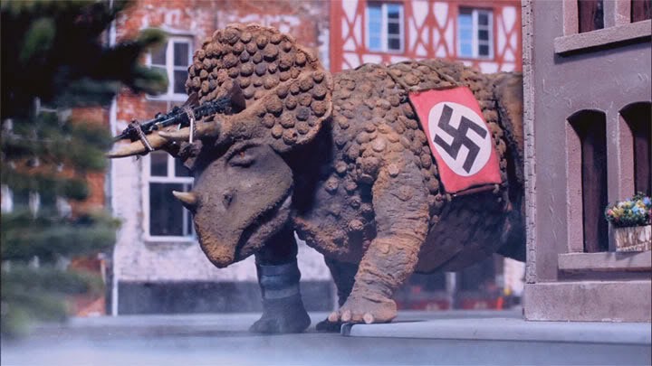
Trigger-happy Triceratops


Here's aiming at you, kid!


Leader of the '5', known as Chestbridge (or "The Colonel")


Don't ask me! I haven't seen this episode yet...


Clearly, a Nazi Dog.


Clearly, a Nazi Nun?


Ummm...


Last, but not least, here's a promotional shot of our intrepid '5'.
L to R - Jackson, Pierre, Claire, Ilsa, and Tucker


Now, if any of that has you intrigued, you should be able to find 'Danger 5' on Netflix for your viewing pleasure. Hope you enjoy it, I sure have!


March 31, 2012

What A Book!: 'Mail-Order Mysteries' by Kirk Demarais


This colorfully eye-popping book exposes the "real stuff" kids got whenever they ordered something from old comic book ads back in the day. You know, stuff like the Secret Agent Spy Camera, X-ray Spex, Sea-Monkeys, etc. Sometimes they'd get pretty much what they expected, but MOST of the time "disappointment" was the name of the game. By documenting more than 150 of these "extraordinary, peculiar, and downright fraudulent collectibles", Demarais also reveals the secrets behind these too-good-to-be-true widgets and gizmos found only advertised within the comic books of yesteryear.

Here, take a look at some of the fun inside...


Horrifying!
Exciting!
Thrilling!
Disappointing.
(And it's all FREE... for only $1.00)


                                                                                                                                          Just add water!
Guaranteed to
grow disappointment!


                      Not X-actly what
kids X-pected...


I absolutely love this book! It's SO up my alley it's not even funny. Great layout/design, colorful, fantastic photos of everything, AND it's totally retro! I give it an A+!

So if you're at all intrigued by this mini-review, go get yourself a copy. Or, heck, you could mail-order one... At least now you'd REALLY know what you were getting BEFORE you got it!

March 10, 2012

"Oh, boy! Tin toys!"


Tin toys are certainly among my favorite types of toys to collect. I find all of the colors and different characters quite charming. Not to mention how neat the mechanics are on the ones you can wind-up. But just as interesting as the toys themselves, is their rich history.

Tinplate was used in the manufacture of toys beginning in the mid-19th century. The toys were made from thin sheets of steel plated with tin, hence the name tinplate. They were a cheap and durable substitute for wooden toys. The toys were originally assembled and painted by hand. Spring activated tin toys originated in Germany in the 1850s. In the late 1880s offset lithography was used to print designs on tinplate. After the colorful designs were printed on the metal, they were formed by dies and assembled with small tabs. The lightweight of the toys allowed them to be shipped less expensively and easier than the heavier cast iron toys.

Germany was the major producer of tin toys in the world during the early 20th century. The most famous German manufacturer of tin toys was Ernst Paul Lehmann who is said to have exported 90% of his toys. France and England joined the fray and it wasn't long before hundreds of thousands of these tin toys were being manufactured.


Production of tin toys in the United States started earlier, but began in earnest when tin ore mines were opened in Illinois providing easily available and cheap raw materials. A number of manufacturers scrambled to catch up in the beginning of the 20th century, but it wasn't until after World War I, with anti-German sentiment high, that they began to make real gains. There was a growing demand for American produced products and by the 1920s American firms had overtaken the competition. The largest and most successful firm from the 1920s to the 1960s was Louis Marx and Company. Marx produced a huge number of designs and depended on large sales volumes to keep prices down.

The production of tin toys was discontinued during World War II because of the need for raw materials in the war effort. After the war, tin toys were produced in large numbers in Japan. Under occupation and the Marshall Plan, manufacturers in Japan were granted the right to resume production. The idea was to give Japan all of the low profit; high labor manufacturing and the US companies could sell the imported product. It worked better than they had expected and Japan became a tin toy manufacturing force until the end of the 1950s. In the 1960s cheaper plastic and new government safety regulations ended the reign of tin toys. Presently, China has taken over the role of the leading tin toy manufacturing country.

And there you have a brief historical summary of where tin toys came from and what they went through so that you and I could enjoy them today.


What I wouldn't give to be that kid for a day... He's just having SO much fun with his robot! And those goggles, I wonder what he's seeing through those? X-ray vision, perhaps? Whatever the case, today is Saturday and we should all go out and play, with our tin toys, or not!


~ Information Source: Wikipedia,  Photo Source: Google Images ~

July 6, 2011

Monsanto: From chemicals and plastics to amusement park wonder


Today, there seems to be a lot of controversy surrounding Monsanto and their practices. Perhaps there always has been, but I don't want to go into any of that here. I just want to focus on some of the company's more exciting achievements such as their creation of "NEW colors, NEW materials, and NEW designs for plastic housewares" as well as having sponsored two of the most beloved and sadly missed attractions at Disneyland.

Doesn't that ad up there make plastic look enticing? It's all just so COLORFUL and SHINY! By the look of it, I'd say marketing was certainly a Monsanto strong point. Check out what the text says in the ad. "LOOK... TOUCH... LIFT... and see what wonderful uses today's stylists and designers have found for plastic's lustrous lightness, fluid grace. Now plastic housewares are at home in every room of the house... reflecting the skill of craftsmen working with Lustrex, Monsanto's styrene plastic molding powder. Modern, exciting, durable, they are available in a wide range of colors, including crystal clear and the newest pastels. Look for these exciting new plastic housewares at your favorite store... you'll use them everywhere!" Well, wrap 'em up 'cause I'll take every last one of 'em! I'm a total sucker for slick talk and fancy presentations.

Speaking of presentations... Monsanto sponsored two classic Disneyland attractions. One was the big, plastic, walk-thru House of the Future which lasted from 1957-1967. And the other was everyone's favorite, the awesome Adventure Thru Inner Space ride. That one lasted considerably longer, existing from 1967-1985.


"Gee, but peeping in on the people
of tomorrow sure is romantic, Johnny!"


"Don't open the drapes, Delores.
I have a feeling we're being watched..."


Unfortunately, I was born a bit too late to have enjoyed the HotF first-hand. But, boy, did I enjoy me some Inner Space! I can remember being sooo fascinated with that ride, especially at the beginning where the HUGE microscope "shrinks" you down to atomic proportions. Of course, at a certain age it became obvious to me that it was all just an illusion, with tiny fake people. But up until then I was totally convinced. A little scared, even.


I'm probably in that line somewhere crying
because I'm afraid I'll soon be shrunken.


Riding along in your atommobile, there just wasn't
ANYthing else like it. Period.


Say what you will about the Monsanto of today. And I DO understand that plenty of people have much to say... I, however, much prefer the Monsanto of yesteryear. And I'll take it in a crystal clear, Lustrex plastic container, please.

June 15, 2011

Show & Tell: Art Frahm's 'The Crossing Guard'


While wandering through an antique mall over the weekend, I stumbled across this colorful gem of a picture hanging in a simple 8x10 frame. My eyes just about popped out of their sockets because, as my good friend Matt said, "It's sooo up Anthony's alley!" And if you're a regular Pop Circus visitor you know how true a statement that really was. So, of course, I snatched that puppy right up and took it home. But I was curious to know more about the artist. Just WHO was this Frahm person? Was this print out of a book, or was it one in a series? I had to know more. To the internet I went, and what I found was quite interesting...

Art Frahm (1907-1981) was an American painter of campy pin-up girls and advertising. He lived in Chicago and was active from the 1940s to 1960s. Today he's best known for his "ladies in distress" pictures involving beautiful young women whose panties mysteriously flutter to the ground in public situations, often causing them to spill their bag of groceries.

Frahm was commercially successful, and even his falling-panties paintings were later imitated by other pin-up artists. In fact, to this day the falling-panties art has a small cult following as mid-20th century kitsch, or even as fetish art.

In addition to pin-ups, Frahm created a series of humorous hobo-themed calendar illustrations. Another set of paintings celebrated traffic safety, complete with smiling, chubby crossing guards and schoolchildren. (Ding! Ding! Ding! Just like the one I have!) His advertising art included works for Coca-Cola and Coppertone.


Boy, talk about one extreme to the other, huh? Somehow, Frahm even managed to make an adorable pup look like a "horn dog" in the second picture. That's a bit TOO creepy. I think I'll just stick with the traffic safety series, thank you very much.

May 10, 2011

Fun with Dick and Jane

I love the innocence of things like Dick and Jane, but I also can't help twisting it around and corrupting it a bit. Here's a mere sampling...


Everyone was impressed with the size of Dick's package.
But, most of all, Jane was surprised to learn that Dick
had such feelings for her...


My work is already done, here.


I'm so immature... and I like it! What about you? Do you enjoy being silly and irreverent? If so, tell me all about it. I'm sure the rest of our readers would get a kick out of it, too!

March 17, 2011

Retro Book Fair: Corinne Malvern's 'Mother Goose'


It's that time once again, folks...
Yes, come with me and "get your book on"!

Today I'm sharing a children's book that is chock full of colorful and charming illustrations. It's Corinne Malvern's 'Mother Goose' and it was published/printed in 1953. The book's condition is pretty awesome, too, when you consider that it's almost 60 years old! I'd love to frame a few select pages, but I wouldn't dare separate them from the original book. That just IS NOT allowed! Did you hear me? NOT allowed!

So, anyway, check out the great cover, below, followed by a few of my fave nursery rhyme/illustration combos from inside...


As if the cover wasn't cute enough,
it actually wraps around to the back
with even MORE adorable characters!


I love the colors, here, and all
of the care-free romping. Do
kids even "romp", these days?


"She whipped him, she slashed him..."
NOT much of a lady in my book!


You and I both know that MUST
be a cubic zirconia she's holding...


This one's my absolute favorite!
It's really cute and just a tad creepy...


There are many, many more within the book, but I wanted to keep things short and sweet. I did a pretty good job of that, huh?

February 22, 2011

"Bras and panties and briefs, oh my!"


Hey, everyone, it's time for a party! And the attire for this shindig is nothing but your skivvies, so if you'd like to peel everything else off and join the fun, go right ahead! Though, you might want to draw your blinds and curtains first...

These old ads for men's and women's unmentionables are quite a hoot to look back on nowadays. However, not only good for a hearty chuckle, they're also interesting examples of classic advertising methods. Come take a look, won't you?...


Something tells me these three
just participated in something
completely satisfying.


Ooh, la la!


See, no matter how badly you
want to rip those shorts off of
another man, you can't tear the fly!


I can't believe that's not a
vagina stitched onto the front...


Men, hide your dix
in Globe-tailored Slix!


Just place them, press them
and forget them? I'd love to
see that lady play an entire
game of tennis with those
booby cups on...


No equal for... GAY.


"Stick 'em up... and WAY out!"


Well, if it isn't a million he's feeling like,
he's obviously feeling "something"
quite special...


Now, wouldn't you say this is
taking Casual Friday just a
little too far?


That about does it for this Pantie Party, or Skivvy Soiree. I hope you all had fun! And don't forget to put your clothes back on BEFORE you re-open those blinds and curtains, unless you enjoy that sort of thing...


~ All images taken from the postcard books, 'Brief Encounters: Men's Underwear in the Classic Age of Advertising' and 'Brief Encounters: Women's Underwear in the Classic Age of Advertising'. Both published by Prion Books Limited, London. ~

February 11, 2011

Retro Book Fair: 'Vision - How, Why, and What We See'


Hello, all! I know that it's been quite a while since I've written a legitimate post, so I thank you for your patience and loyalty. You know how life can be sometimes... It can really make it hard for us ADD afflicted to focus on ANYTHING, let alone a blog! But enough about that!

I'm excited to share with you a new (old) children's book that I recently got at a local used bookstore. The book is titled, 'Vision - How, Why and What We See' and it is one in a series of books called the 'Golden Library of Knowledge'. 'Vision' was printed in 1962, and I think the charming illustrations (by Weimer Pursell) depict that. Here, take a look at some of them, beginning with the book's cover...


I really dig this cover!
The combination of the colors used
and the stylization of the image make
it very pleasing to the "eye".


Outer organs of the eye serve a primarily
protective purpose.


The convergence of the telephone lines, the decreasing
size of the poles, and the haziness of the more distant
buildings help to create perspective.


Why does an apple look red? First of all, you are
probably looking at the apple in good light. If
you look at it in very dim light, the apple will
look black for the sight-receiving cells in the
retina that "see" color are the cones, and cones
are useless in dim light.

To see red, you must have good color-sensitive
cones. Many animals and some people have
cones which are able to see small details distinctly,
but cannot recognize some or all colors. They are
said to be color-blind.


White light entering a prism breaks
down into the colors of the spectrum,
as seen above. It is possible for an
inverted prism to recombine the
spectrum into white light again.


Color-blind people are unable to see
the red O and purple X, above.


Many birds have keener vision than we have.
The hunting birds - vultures, hawks, and
shrikes - can spot very small animals on the
ground hundreds of feet below them.


The Snellen Eye Chart, above, was
designed to aid all who train in
testing distance vision against an
accepted norm.


So did you have fun learning tidbits about vision in the Golden Library of Knowledge? I thought you might! Be sure to come back next time Retro Book Fair stops by the circus... I have a pretty good feeling even more vintage fun is in store! Meanwhile, have a wonderful weekend, everybody!!


~ All images taken from the book, 'Vision - How, Why, and What We See' by Janette Rainwater. Illustrated by Weimer Pursell. Published by Golden Press, New York. ~
Related Posts with Thumbnails