December 20, 2010

Show & Tell: Our Playmobil Victorian dollhouse, a Christmas tradition.


I have mentioned before that I never really outgrew toys, right? Well, here's even more proof of it! Yes, this beautiful Playmobil Victorian dollhouse has graced our home for the holidays, proudly displayed by, or near, the Christmas tree for almost 18 years. And it is certainly one of my favorite Christmas traditions!

When it isn't out at Christmastime, it's tucked away up in a closet the entire rest of the year, so you can imagine how dusty it gets. I actually kind of enjoy the whole process of taking it down, meticulously cleaning it (inside and out), and then, the BEST part of all... placing the furniture and people inside!!

The following photos are a somewhat goofy gallery of interior shots (plus a few exterior) just to give you a closer look. Btw, for some reason, I had a devil of a time getting the lighting just right. So if they seem a bit funky, that's why. Enjoy!


Here is the back side of the house, with
"handy" access to all rooms and floors.


These lovely ladies are relaxing in the living room and
enjoying a command performance by the pianist
on the left (you'll see his piano in the next shot).


Here is the artist at work, on a piano that really plays!
(Well, technically, it's just an electronic tune when
you press down on the keys...)


One of many maids, Sophie arranges place
settings at the formal dining room table.


Meanwhile, out in the nearby moonlit forest, a small
family of deer is seen grazing along the barren, icy floor.


Jane, the kitchen maid.


Jacques, the house chef.


Maxwell, the family dog.


Grampa enjoys his newspaper next to a toasty fire.


Unbeknownst to Grampa, a fiendish
imposter lurks in the shadows nearby...


Look out, Grampa... She's right behind you!


Between the den and the veranda lies one of the
bedrooms simply referred to as the Flower Room.
(Notice the detail of the chamber pot sitting on
the floor, next to the bed. Sign o' the times!)


Out on the veranda, a professional photographer
takes a lovely holiday portrait of a fine couple.


Here we see the other bedroom, aka the Red Room,
and it looks as though we've caught a young couple
just settling in for a nice, long Winter's nap... 


Yet another maid, Louise, ensures that sanitary
standards are upheld at all times in
the house's one and only bathroom.
(It ain't a fun gig.)


As we progress up the stairs to
the attic nursery, we can see both
kitties AND kiddies.
(Har, har! Get it?)


Like typical children, this close to
Christmas it's real hard to go to sleep!


Well, folks, that concludes our tour of the Playmobil Victorian dollhouse. Sure hope you liked it! Until next time, I wish everyone a very merry Happy Holiday and a shiny New Year!!


~ All photos property of Anthony See. ~

December 6, 2010

"Hey, Santa! Whatcha sellin'?" - The jolly old elf in advertising.


How can anyone say "No" to a face like that? Besides, it's freakin' Santa Claus! And WHO doesn't like him?? Well, if YOU don't, go play on the freeway. You're dumb! Plus, you'll probably get coal in your stocking...

Anyway, for the rest of us who DO still like good ol' Saint Nick, I've compiled a gallery to display just some of the finer examples of his contribution to advertising. This would also be considered an "old skool" edition, mostly because I don't think any of these ads date past the 1960s. Oh, and F.Y.I., these are only the tip of the iceberg. As I continue to sort through and find more gems, I'm sure the urge to share will be much too hard to resist! So, for now, please enjoy what I've collected below.


I really like how colorful this is! And how great is it that
the "train" is actually one of the Christmas crackers?!


I think the detailed artwork in this is very
impressive! Love the lettering font, too!


As if Santa wasn't already huge enough with
everyone, here he's quite literally HUGE...
He's a GIANT! Just look at how he towers
over those rocky mountains beneath him!
And I'm sure it's because he eats lots and
lots of Sunkist Seedless Navel Oranges!


I can't even tell you how MUCH I absolutely
LOVE this image! It just makes me HAPPY
in all sorts of ways! Even just the name
"Ribbon Candy Rocket" makes me giddy...
Yep, I'm gay.


I like this, but what I DON'T like is how
Jack and Betty just demand, "Bring us
Tinker Toys." WHERE, may I ask, is the
"Please" in that request? Hmm? I think
Santa ought to skip their house!


Isn't this great? I just hope that was the
LAST house on Santa's route...


Again, another very pleasing one to me!


I don't know about you, but a Thermos has
NEVER been on MY Christmas wish list.


It'd sure be a shame if all Santa was carrying
in his bag-o-tricks was Colgate products, huh?
He'd BETTER have some toys in there, too!


Not sure if this is from the 1950s or '60s, but it
rings early '60s to me, for some reason. Is Santa
actually demonstrating that the television is
slightly narrower than his own waistline?
Could that really be a selling point?


This is quite nice.
It reminds me of Santa's Village!


Well, that'll do it for today's gallery, kids. Check back again, real soon, to see what else is NEW at the circus! In the meantime, try to relax and enjoy the holiday season. "See" you later!


~ All images taken from the book, 'Christmas: Vintage Holiday Graphics'. Edited by Jim Heimann. Published by Taschen. ~

November 13, 2010

Vintage Drugstore Carnival: 'Lifebuoy Health Soap'... The soap of considerate people.


"Peggy, did you catch a whiff of Fran?"

"Oh, my. I thought I smelled something, Helen. But, you know, I'm not the least bit surprised. The other day, we were at the supermarket together and I couldn't help noticing that she had some cheap, off-brand bath soap in her shopping cart..."

"Tsk, tsk. What some women won't do to save a few pennies!"


~ Image taken from the postcard book, "Just what the doctor ordered": Health and Grooming in the Classic Age of Advertising. Published by Prion Books Limited, London. ~

November 9, 2010

Vintage Drugstore Carnival: 'Bile Beans'... To be attractively slim, and to ensure regular daily elimination!


While Bile Beans were initially pitched as a cure for biliousness, the influenza epidemic of 1899 was too good an opportunity to miss. Horrible though the flu was, a lot of people would recover after a week or so anyway, and it was an easy matter for quacks to point to cases where the recovery coincided with the taking of their medicine.

A leaflet enclosed with the Beans stated that they were also a cure for cirrhosis of the liver, blackheads, and all "female complaints" (Sorry about that, ladies), and later they were mainly targeted at women, using glamorous pictures that now appear incongruous with the unattractive product name. Although the leaflet said that the Beans did not include mercury, bismuth, or aloes, they did contain aloin - an aloe extract with laxative properties that is no longer considered safe because of its potential side effects. The other ingredients were cardamom, peppermint oil and wheat flour, with a black gelatin coating. Yummmy!
 
The story behind the Beans went that an Australian scientist, Charles Forde, had discovered an ancient aboriginal remedy. The actual inventor was a Canadian called Charles E. Fulford, and the story about the aborigines was completely made up. Although this was revealed during a 1905 court case where Fulford sued the proprietor of an imitation product, the Bile Beans became very popular in the 20th century and were still on sale in the 1980s.
 
 
~ Image taken from the postcard book, "Just what the doctor ordered": Health and Grooming in the Classic Age of Advertising. All info taken from thequackdoctor.com.


November 7, 2010

Vintage Drugstore Carnival: 'Scott Tissue'... When peculiar, private itching breaks concentration.


"When I asked Mary what was the matter she complained of an itching. I asked a friend's advice at Mother's Club that afternoon. She said it was probably caused by harsh or impure toilet tissue, and recommended Scott Tissue." Those were the days when advertising still used some level of discretion. Boy, nowadays we see animated bears dancing around on the T.V. with toilet paper confetti stuck on their rumps! I suppose the people who are marketing that particular product think they're being subtle, but come on... Those damned poo bears are pretty blatant! And I guess I just find it somehow more disturbing since it's trying to be all cutesy-cartoony about bears pooping and the toilet paper sticking to their dirty butts. It's just gross, you know? Not that I'm a prude, because that certainly isn't the case.

Another part of the ad text that I find interesting is where it goes on to share how experiences like Mary's "are common. Harsh tissue can cause serious inflammation. Women and girls especially, because of their peculiar requirements, need a soft, highly absorbent tissue - such as Scott Tissue or Waldorf."
Evidently, those "tissue issues" can mean some serious "sh*t" for the ladies. Or so they'd like us to think...


~ Image taken from the postcard book, "Just what the doctor ordered": Health and Grooming in the Classic Age of Advertising. Published by Prion Books Limited, London. ~

November 5, 2010

Vintage Drugstore Carnival: 'Listerine'... Because halitosis makes you unpopular.


"Don't fool yourself! Since halitosis never announces itself to the victim, you simply cannot know when you have it." Ya gotta love that sales tactic! Nothing seems more effective than fear or paranoia to really push a product. And if that doesn't work, surely knocking down people's self-esteem by telling them they'll be "unpopular" should do the trick! If you click to enlarge the advertisement, pay particular attention to the FACTS in the lower right-hand corner. I love that they're relying on what 68 hairdressers had to say about their clientele, "many of them from wealthy classes". And, after all, "Who should know better than they?"


~ Image taken from the postcard book, "Just what the doctor ordered": Health and Grooming in the Classic Age of Advertising. Published by Prion Books Limited, London. ~

November 4, 2010

Vintage Drugstore Carnival: 'Grove's Tasteless Chill Tonic'... Does a body good!


In this chill tonic, which came out in 1878, Edwin Wiley Grove found a way to bottle a quinine (only known malaria medication of the time) mixture that would eliminate the bitter taste. This tasteless tonic, which some claimed wasn't all that tasteless, was quite an improvement over taking straight quinine for fever and chills caused by malaria. A sweet syrup and lemon flavor was added to the quinine, along with cinchonine and cinchonidine, which were the main ingredients in crystal form within the tonic. The chill tonic was so popular that the British army made it standard issue for every soldier going off to mosquito infested lands and, by 1890, more bottles of Grove's Tasteless Chill Tonic were sold than bottles of Coca-Cola.

So much success... All achieved with a marketing campaign like that one??!
Boy, have times changed.


~ Image taken from the postcard book, "Just What the Doctor Odrered": Health and Grooming in the Classic Age of Advertising. Published by Prion Books Limited, London. ~

October 31, 2010

Trick 'r Treat!


"Boo", everyone!
Please, enjoy this gallery of happy Halloween hijinx...
if you dare!


I can hardly stand seeing this pic. Guess
I just don't have the stomach for it...


What you can't see here is the small print
which reads, "Butcher knife sold separately."


Alright. As far as I'm concerned, these pumpkins
are sooo hideous that they're actually "cutting edge!"


Holy crap! If these kids were walking down
MY street, I'd find me a baseball bat QUICK!


Nothing funny, here. I just like the soft
candlelight from the jack-o-lantern. Plus,
I think she's a pretty lady.


...And then eat ALL of their candy
once they've gone to bed!


Happy Halloween! And remember, don't open your front door if the Trick 'r Treaters are so tall you can see their eyes through the peep hole!


~ All images taken from Jim Heimann's book, 'Halloween: Vintage Holiday Graphics'. Published by Taschen. ~

October 29, 2010

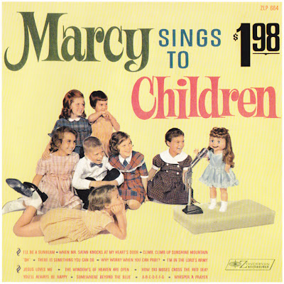
The Worst Album Covers Ever!: 'Marcy Sings to Children' by Marcy Tigner


Artist ~  Marcy Tigner
Title   ~   Marcy Sings to Children

                    Marcy Tigner was an aspiring gospel singer whose
                    career was stymied by her high, childlike voice. She
                    finally found fame after learning ventriloquism and
                    inventing her "Little Marcy" character. She released
                    dozens of records in the 1960s and '70s and was
                    wildly successful.


As far as I'm concerned, this is a perfect album to share this time of year! It's just so darn creepy, don't you think? There's something about that little doll singing on that little stage of hers... I know, I know, it's all supposed to be nice, innocent fun. But did you happen to notice the second song title on the first side of the record? It's 'When Mr. Satan Knocks At My Heart's Door', for corn sake! Now, if that doesn't at least seem creepy to you...


~  Image and info taken from the book, 'The Worst Album Covers Ever' by Nick DiFonzo. Published by Barnes & Noble, Inc. ~

October 14, 2010

Advance to Hollywood! My on-camera MONOPOLY interview with documentary filmmaker, John Wellington Ennis.


Imagine my surprise upon receiving an email from a young, accomplished, and well-respected independent filmmaker from Beverly Hills. Now, imagine how I felt after reading that he wanted to sit down and interview me, on film, about my knowledge and enthusiasm for the game of Monopoly. I just about flipped my board! But seriously, I was more skeptical about the whole thing at first, than I was excited. I mean, why would this Hollywood filmmaker want to talk with me about such a commonplace game in our regular, everyday pop culture?? However, after some correspondence with Mr. John Wellington Ennis, I finally understood where he was coming from. It's simple, really. See, what interested John in the first place was my original post on Monopoly I wrote back in July of 2009. He said he not only liked how informative it was, he also really liked my enthusiasm for the game and thought that my energy could be good for his film.

So that explains why John was interested in talking with me, but it doesn't tell the whole story... The bigger picture in John's film, PAY 2 PLAY, consists of using the game of Monopoly in a symbolic way to help illustrate "the cycle of how political campaign costs breed corruption, making candidates beg, borrow, and steal." It also "shows how" we can "take back the election process and hold corporations accountable." And it also happens to be a sequel of sorts to his previous, critically acclaimed doc, Free For All!, which detailed the corruption of the 2004 U.S. election.


John, behind the camera, and li'l ol' me in front of it.
Man, are those camera lights bright!


Needless to say, I was pretty nervous come interview hour, never having done anything like it before in my life! But I must say that John was so professional and so good at directing me that I almost instantly felt at ease in his hands. I had a total blast talking about one of my favorite board games of all-time! I just hope that I didn't make a total fool of myself on film, you know? I have yet to see any part of what John shot, so it'll be quite interesting when I finally do get to see it...

The project is in post-production as I write this, and in desperate need of funding to complete. So if you're at all interested in donating to this wonderful cause, please, check out the information below. You can also click on the attached link to view a preview of the film! You should really look into it, whether donating, or not, because john is a brilliant, witty filmmaker who infuses his work with plenty of intelligence and humor. I'm telling you, I believe in this guy. And I'm not just saying all of this because he's putting me in his documentary, but rather I think his films are good enough to actually make a difference.


Here's another shot, from a different angle, of John setting up his
camera equipment. FYI - I only LOOK calm, cool, and collected...


Yet another shot of the set up, however, I think John
might've already begun asking me questions, here.


At this point, the main interview was over and John was curious
to see what different variations of Monopoly I owned, so I
busted out a few and set 'em up for the camera. John was such
a cool guy, I sorta wished he had the time to stay and play an
actual game... Of course, that easily could've taken hours!


It's a wrap!
Me, and John Wellington Ennis after a successful afternoon shoot.


~ All photos taken by Tommy Kovac, and property of Anthony See ~

October 5, 2010

Guilty Pleasures: Kanye West on SNL


First off, I'll have you know that I do not like rap. Not. One. Bit. Secondly, I must say that I cannot stand Kanye West's arrogance. Not. One. Bit. It bugs me so much that I usually refuse to even look at him, much less listen to any of his music. So the fact that I actually enjoyed watching his performance last Saturday night, on SNL, has me completely baffled.

Particularly his second act of the evening, 'Runaway', had that "something" special about it. I'd almost dare to describe it as "beautifully artistic, with an edge". And whether the lyrics are heartfelt, or not, the song does convey a certain amount of humility (which is quite a foreign concept to Mr. West). I guess that's why it grabbed my attention and didn't let go. I mean, as he sings he basically admits to having been a jerk, an a**hole, a douche bag, etc. which is, after all, pretty satisfying.

But all pettiness aside, I enjoyed the spectacle of it. I liked the song; it was pretty great, even with the rap. The ballerinas were awesome. It all looked beautiful flooded in that bright white light. And dare I admit it... I actually thought Kanye was fricking fantastic!

Take a look for yourself, and enjoy the show!


Related Posts with Thumbnails